Around the World with the Most Travelled Indian
 By Nitin Gairola
We visit a country in Africa and say we have gone to Africa, forgetting that the world’s second largest continent, after Asia, is Africa. Now tell me if you visit the US or the UK or Japan, do you say you are going to North America or Europe or Asia? But we all, including me, are guilty of using the broad brush to paint all African countries with. When we visit Kenya, we are going to Africa. When we visit Tanzania, we are going to Africa. When we visit Zimbabwe – well you get the drift.
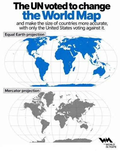
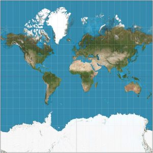
We are talking about 54 countries in Africa out of the 193 or 195 nations in this world (depending on how you see the world) and UN’s Equal Earth map aims to show the relative scale of the continents as they actually are in the real ‘world’. This map was developed back in 2018 by Bojan Šavrič, Tom Patterson and Bernhard Jenny and because it gets the relative scale almost right, Africa looks its real size when compared to others. On the other hand, Russia, Greenland, Canada and even US look a lot smaller as they are in the northern latitudes. This is since the globe, which most would agree is the true shape of our planet, has been ‘flattened’ on a 16th century map known as the Mercator Projection. It was made to aid navigation by getting the latitudinal degrees right, with overblown landmass sizes (other than those within the tropics) being the big trade off. That’s why the places in the extreme latitudes appear super spread out. Even worse are the areas near the Arctic Circle which become extremely disproportionate to their reality. I carefully didn’t focus much on the lands on the other side of the planet, near the Antarctic Circle, since there is hardly any land there down south, save Antarctica itself at the pole. You see, we are a very north centric planet at this time in our geological history, but it was not always so nor will it always be so (the continental plates of our planet move, albeit over millions of years, in order to be noticed).
And here are some fun facts – Greenland is around the size of Mexico; Russia fits very nicely within slightly more than half of Africa; and the granddaddy, USA, is around the size of the Sahara Desert, which is just one part of Africa. Besides, the entire EU (or Europe, excluding Russia) can easily fit in the relatively narrow southern part of the continent.
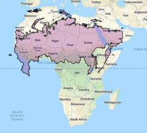
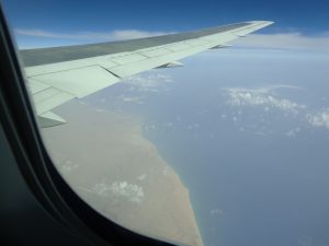
We are talking about a landmass that is 30.3 million square kilometres in area. Crossing Africa will make you realise that the world is not that small after all. This size of Africa is the reason why I have not been able to colour my entire world travel map just yet, since there are quite a few white spaces still left in the world for me – primarily in West Africa. It is taking that long to visit every place in this giant continent. It doesn’t help one bit that the travel infrastructure in many parts of Africa is not well developed, i.e., limited & expensive flights, almost no passenger trains and actually almost no railway tracks other than a few in the east and nearly zero cruises on its not-so port friendly coasts. It’s just road travel here and don’t even get me started on the state of the roads or the transport options. Some portions in the more developed East are still better, but the west is another story. That’s where we will soon be for our next adventure.
But Equal Earth is not a perfect map either – just a better representation than the standard Mercator projection. Area, shapes, distances and directions cannot all be accurate at the same time since a globe is a globe and here you are trying to paste a sphere flat on a wall. Thus, with a map, if you get the area of a landmass right, then there are bound to be other geographic inaccuracies.
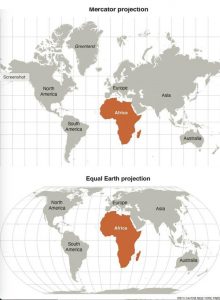
Equal Earth actually solves two fundamental issues – The scientific or the geographic one which is the relative size and the social & political one which is how Africa is perceived in our collective consciousness. The core issue was that the modern world continued to accept a 16th century flat map (made by Flemish cartographer, Gerardus Mercator) which was originally meant for sea bound navigation. While correct in its own unique way, it has yet been depicting a certain biased image of the planet in every textbook of every school around the world. In this planet today, the developed nations are mostly in the north and that’s why the map further adds to the imposing and imperial image of USA, Canada, EU and Russia.
Equal Earth in my view is actually more of a social & political statement for Africa rather than a scientific one. This map was not just pushed forth by scientists and scholars from Africa but also by the African Union and in 2026 it gathered steam under the ‘Correct the Map’ initiative. That’s why cartography is less science & geography and more power & politics.
And so, finally on the 4th of September 2026, the UN General Assembly adopted a resolution named ‘Correct the Map’ with the intention of rebalancing the scale and perception of Africa – 164 countries voted in favour, including India, and so one may call this a landslide victory for Africa on the world stage. The US, led by a rather strange human being, not surprisingly voted against and 6 countries sat on the fence – these were Estonia, Lithuania, Moldova, Serbia, Georgia and Ukraine. East Europe is in the middle of Eurasia, after all.
But given how sensitive such a subject can be, with far reaching ramifications, the UN clarified that the Mercator projection is not banned here onwards or has to be replaced by Equal Earth in all text books; Equal Earth is not the world’s new official map that is to be adopted by all government offices, schools or corporations. UN also clarified that the new map doesn’t impact borders or the legal status of disputed territories (will just speak about the storm it stirred up in India though). In their predictable fashion, they have just ‘encouraged’ the propagation and use of this map.
And while India voted in favour of Equal Earth, but as I mentioned just now, there was that sensitive matter about our re-drawn northern borders that caught the attention and drew a stern response from New Delhi. And so, on 6th September, the External Affairs Ministry stated that our Northern & Eastern borders were to be drawn in accordance to India’s official map, and the present depictions were not at all acceptable. This is how ‘political’ map making can be and to my knowledge, so far the UN has not responded. Ukraine also has similar objections as to how Crimea was depicted, however, just like India they were fundamentally supportive of the idea of Equal Earth when it comes specifically to Africa.
Maps are such powerful tools of knowledge, perceptions and leverage and one of my strongest memories from childhood is my gazing at maps of the world all day long in my favourite encyclopaedia. I used to read each name – every country, city, river, mountain & plain, and also the names of deserts & forests that were marked. That is how my days used to pass at a time when we didn’t have many distractions and boredom was a real thing. That’s why maps are very close to me and I have quite a collection of wall maps – from the usual political and physical ones, to those that depict the natural world biomes, wildlife, and even migration patterns (of animals) and ancient navigation routes (of humans). So, no surprise, this news of Equal Earth got me interested and I again surrounded myself with my atlases, maps and my globe.
Nitin Gairola has travelled to every major desert & forest ecosystem besides every other natural world biome on Earth, and to around 150 countries as well. He is unofficially known as the ‘most travelled Indian’ and this multi-decade exploration project to witness the entire world is named ‘Borderless Planet’. Nitin is a published travel writer & poet too. Join him @ www.instagram.com/MostTravelledIndian/